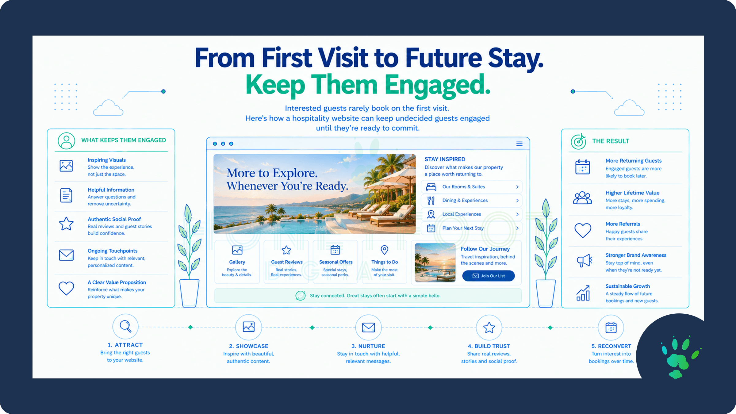
Designing for the Guest Who Isn't Ready to Book Yet
Most hospitality websites are built around a single moment: the guest who arrives, decides, and books. Every page points toward a reservation button, and every success metric is measured against it. That design serves the guest who is ready. It quietly overlooks nearly everyone else.
In luxury hospitality and high-end service categories, the guest who is ready on the first visit is the exception. A honeymoon, a milestone anniversary, a family reunion, a private celebration, or a week of restoration gets planned over weeks or months. It is discussed with a partner, compared against alternatives, and revisited many times. The person browsing today may be six weeks away from a decision, and what the website does for them in the meantime determines whether the property is still on the shortlist when that decision arrives.
Designing for that guest does not mean softening the path to booking. It means building a second path alongside it, one that respects how considered purchases actually unfold.
Why the Decision Takes So Long
Luxury purchases carry more than financial weight. A guest planning a significant stay is also protecting an outcome. The occasion has to feel right, and a poor choice is remembered, visible to the people they invited, and difficult to undo. Add several decision-makers, flexible dates, and a field of comparable properties, and a long research phase becomes the natural result of taking the decision seriously.
During that phase, guests behave in recognizable ways. They visit a property's website more than once, often from different devices. They read reviews in one tab and study photography in another. They send links to a partner or a travel companion and wait for a reaction. They step away, think, and return. A website that treats every visit as a standalone conversion test misses that these visits are chapters of one decision.
This is also where the category separates from typical business sites. The higher trust threshold that luxury hospitality and service businesses face means guests need more reassurance before they commit, and reassurance takes time to accumulate. A website built only to capture the ready guest leaves that accumulation to chance.
Give the Undecided Guest Somewhere to Go
A guest who is not ready to book will not click a reservation button, and a page that offers nothing else leaves two choices: commit or leave. Leaving is the default. The first design task is to offer lower-commitment actions that feel like natural next steps and not like a smaller version of the sales ask.
The right options depend on the property and the guest, but several travel well. An inquiry route that promises a personal reply about dates, occasion, or fit gives a guest a way to ask a question without making a commitment. A well-made guide to the property or the destination, delivered by email, offers something of value in return for an address. A way to share a stay with a travel companion, through a shareable link or a short emailed summary, supports the group conversation that is probably already happening. A simple request to be notified when a preferred season or date opens captures serious interest that would otherwise evaporate.
None of this replaces the primary booking path. The reservation option stays prominent for the guest who is ready, and the secondary options sit beside it in a quieter register. The wording matters too. A secondary action should be labeled for what the guest receives, such as a planning guide, and never for what the business wants, such as a signup.
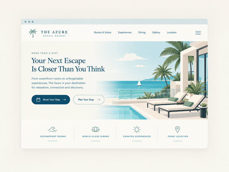
Answer the Questions Guests Ask Before They Commit
Guests in a long consideration cycle are working through a private list of questions. Is this right for the occasion? What will a day actually look like? When is the best time to come? What happens if plans change? Who is this property really for? A website that answers these directly shortens the distance between interest and confidence without adding any pressure.
Occasion-based pages are one of the most effective formats. A page that speaks to a honeymoon, a milestone birthday, or a small private gathering lets a guest recognize their own situation and picture the stay inside it. Seasonal guidance, clear arrival and logistics detail, and plain-language policies on changes and cancellations remove the small uncertainties that stall decisions. Honest fit builds trust as well. A property that explains who it suits, and who might be better served elsewhere, earns more credibility than one that claims to suit everyone.
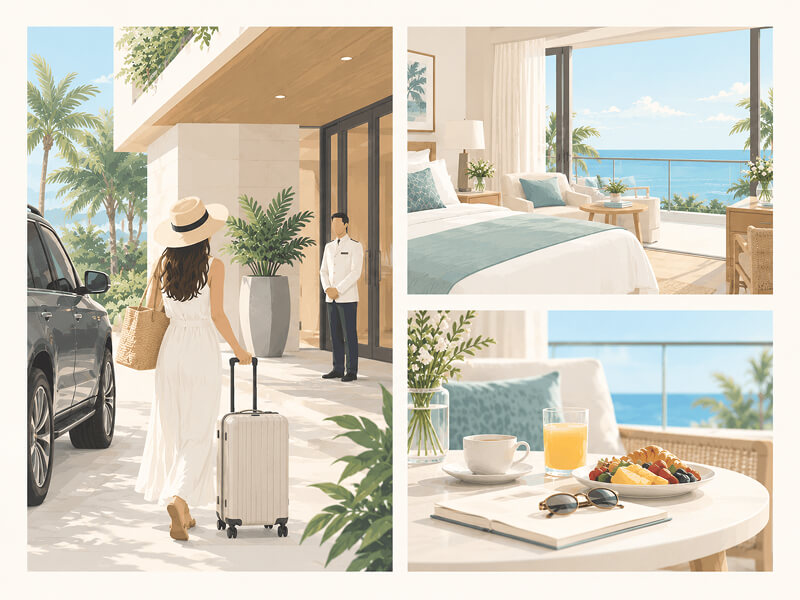
Photography carries a large share of this work, because guests are weighing how a place will feel as much as what it offers. The standards that make it persuasive rather than decorative are covered in the photography standard luxury hospitality websites actually need, and they matter even more here. A returning guest sees the same images again and again, and inconsistency becomes easier to notice with every visit.
Capture Interest Without Applying Pressure
Once a guest has a reason to share an email address, the form that collects it should ask for as little as possible. web.dev's guidance on sign-up forms recommends keeping them minimal, showing only the controls that are needed, and making sure they work comfortably on touch devices. For a guest browsing on a phone between commitments, or on a tablet in the evening, that is a practical requirement and not a courtesy.
An email address alone is usually enough to begin. One optional question, such as the occasion or the approximate timing, makes later communication far more relevant, and guests will typically answer it when the reason is clear. What matters equally is the promise attached to the form. Saying plainly what the guest will receive, and roughly how often, sets the tone for the relationship before the first message arrives. In a trust-sensitive category, a form that feels like a fair exchange reflects the standards of the property behind it.
Follow Up the Way the Property Would Speak in Person
What happens after the form is submitted is where nurture either works or fails. HubSpot describes email as a one-to-one interaction that can be personalized around what is known about a contact, which is the right frame for hospitality. The goal is a short, thoughtful sequence that reads like correspondence from someone at the property and not like a campaign.
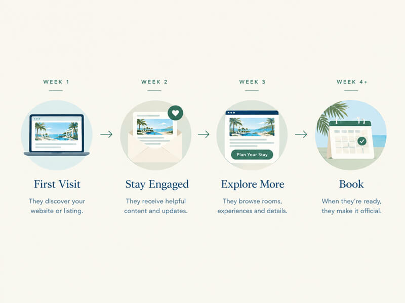
A sound sequence tends to move through a few stages. The first message delivers what was promised, whether that is a guide or an answer, and nothing more. The next helps the guest picture the stay: a day in the life of the property, a note on the season they mentioned, a story about the people who run it. Later messages address the practical questions that hold decisions back, such as what to expect on arrival, how flexible plans can be, and how to ask for something custom. Eventually comes a gentle and genuinely useful invitation to continue the conversation, which might be a note that preferred dates are filling or an offer to answer questions personally.
Cadence deserves restraint. A message every few days feels like pursuit to a guest who has said they are still thinking. Spacing messages over weeks, and stopping the moment a guest books or unsubscribes, respects the pace of a considered decision. The sequence also hands off cleanly to the work of turning guest data into repeat bookings and referrals. Once a guest books, the nurture sequence ends and the post-stay relationship begins, built on the same data and the same voice.
Stay Present Between Visits
Email is only one channel. HubSpot's own account of its nurturing approach notes that email is supplemented by the website, social media, and paid retargeting, all working toward the same goal at different stages of the buyer's journey. For a property, that suggests a consistent presence rather than a loud one. A guest who left after viewing a particular suite or experience might later see a quiet, well-composed reminder of it. A returning visitor might find the site surfaces the guide or page that matches the interest they showed before. The principle across all of it is relevance. The guest should feel that the property remembered their interest, and never that it followed them.
Frequency and tone carry the whole effect. Retargeting that repeats one generic image for weeks reads as noise. Retargeting that shows a different, relevant view of the property each time, in the same visual language as the site, reads as consistency. That is one more reason a coherent visual system pays off well beyond the homepage.
Measure the Guest You Used to Lose
Conversion rate on the booking page is the wrong yardstick for this work, because it only counts guests who were ready at that moment. A more useful picture includes how many visitors take a secondary action, how many return after an initial visit, how long it takes a nurtured guest to book, and which content eventual bookers viewed along the way. These measures describe a decision unfolding rather than a single click.
Over time, they also reveal what the property's own consideration cycle looks like. Some categories average a few weeks and others several months. Knowing the real number lets the sequence be paced to it, and shows how far ahead of a season the content and outreach need to begin.
Building for a Decision That Takes Time
The ready guest will always exist, and the booking path should serve that guest without friction. But the larger opportunity usually sits with the guest who is interested, serious, and not yet decided. That guest is already doing the research. The open question is whether the property's website gives them reasons to stay in the conversation.
Designing for that guest is patience built into structure: clear secondary paths, honest and helpful content, forms that ask for little, follow-up that sounds like a person, and measurement that counts what actually happens. None of it requires pressure, and all of it reflects the standard luxury guests expect from the property itself. A website that does this work does not simply wait for the decision. It earns it.
Does your website have anything to offer the guest who isn't ready to book yet? If you're not sure, that uncertainty is usually the answer, and that guest is quietly moving on to a property that does. Whether you're seeing steady traffic but modest inquiries, wondering how much interest is lost between the first visit and the final decision, or simply ready to build something that supports guests through the whole journey and not just the last click, then let’s have a conversation that starts with an honest look at how your website treats the guest who is still deciding. From there, building something that earns every decision, however long it takes, is a very reachable standard.
Sources and Further Reading