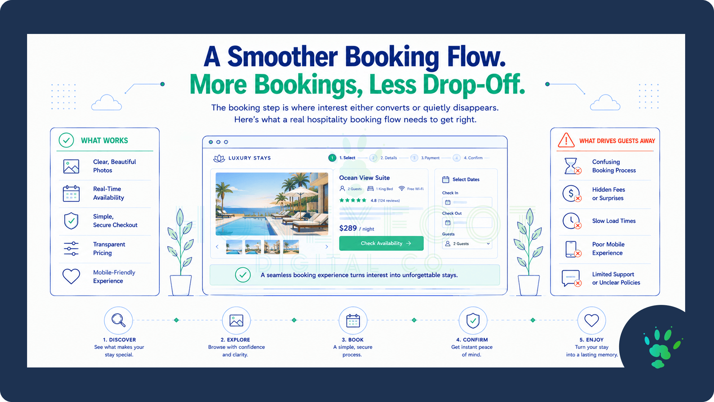
The Reservation Path Is Where Interest Either Converts or Quietly Disappears
Every other page on a hospitality or luxury service website exists to build interest. The booking path is where that interest either turns into a confirmed reservation or evaporates, often without any clear signal that it happened. A visitor who abandons a booking flow doesn't send a note explaining why. They simply close the tab and, in many cases, book somewhere else instead.
This makes the booking experience the single highest-leverage part of the entire site. Every other page can be excellent, and a clumsy or confusing booking path can still undo most of that work at the exact moment it matters most. It's also the part of the site most likely to be treated as an afterthought, quietly inherited from a generic platform default rather than actually designed with intention.
Why This Moment Costs More Than Any Other
A visitor who reaches the booking step has already done the hard work of deciding they're interested. They've looked at the photography, read about the experience, possibly compared a few options. Losing someone at this stage isn't losing a cold visitor. It's losing someone who was genuinely close to becoming a guest, which makes friction here more expensive than friction anywhere else on the site.
This is a meaningfully different situation than a typical business inquiry. A visitor filling out a general contact form is often still early in their decision process and can tolerate some delay or friction without necessarily walking away. A visitor trying to book a specific date, for a specific experience, is in a much more time-sensitive and decisive frame of mind. Anything that slows them down or introduces uncertainty carries a disproportionate cost.
Why a Generic Contact Form Falls Short
A standard “name, email, message” contact form was built for inquiries, not reservations. It asks a visitor to describe what they want in their own words and then wait for a reply, which introduces exactly the kind of delay and uncertainty a ready-to-book visitor doesn't want to sit with.
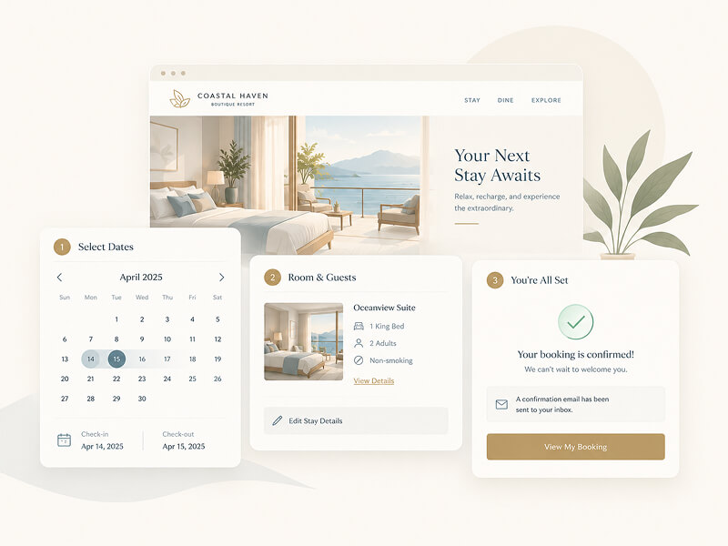
A real booking experience needs to account for what a reservation actually requires: specific dates, availability in real time where possible, party size or guest count, any relevant preferences, and a clear next step, whether that's an instant confirmation or a clearly communicated timeline for one. A generic form forces a business to manually reconcile all of this after the fact, which adds delay on the business side even after the visitor has already done their part.
What a Real Booking Flow Needs to Account For
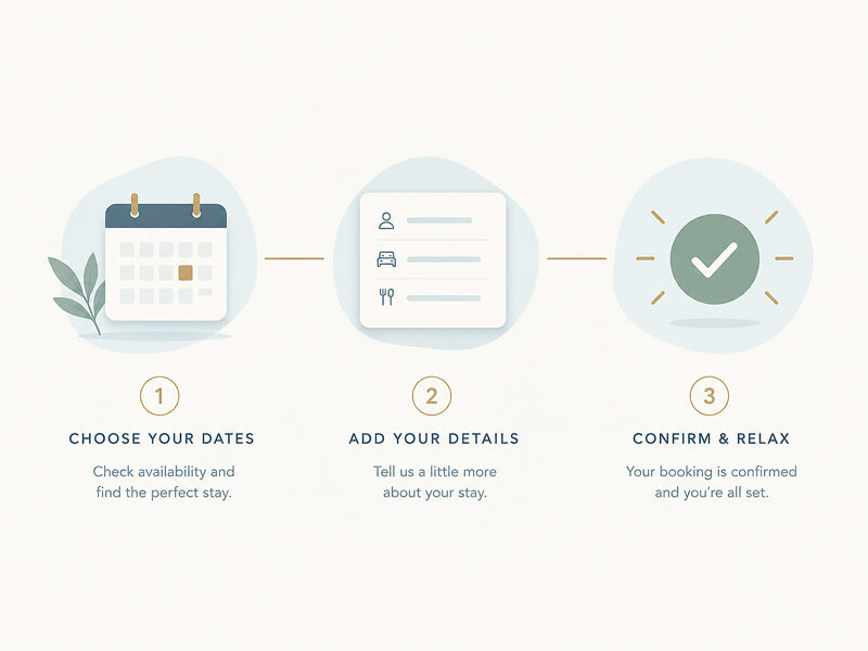
A well-designed booking path typically needs to handle several things a standard form doesn't:
Date and availability clarity. Whether or not real-time availability is technically feasible, the flow should make clear what's being requested and roughly what to expect next, rather than leaving a visitor to wonder if their preferred date is even possible.
Party size, guest count, or scope. Details that materially affect what's being booked should be captured clearly, without forcing a visitor to explain something a well-structured form could simply ask for directly.
Deposits or payment expectations, stated plainly. Ambiguity about cost or deposit requirements at the point of booking creates hesitation exactly where a business wants confidence instead.
A clear, immediate next step. Whether that's instant confirmation, a defined response window, or a follow-up call, the visitor should never be left wondering what happens after they submit.
Reducing Friction Without Losing Necessary Information
There's a real tension in booking flow design between simplicity and completeness. A form with too few fields creates ambiguity that has to be resolved later, usually through a phone call or an email exchange the visitor didn't expect. A form with too many fields creates the kind of fatigue that causes people to abandon it before finishing.
The way through this tension isn't picking one extreme. It's sequencing information intelligently. Google's own guidance on form design consistently emphasizes minimizing what's asked upfront and structuring the remaining fields clearly, since poorly designed forms measurably increase abandonment and, in their words, every bounce represents a lost and frustrated visitor rather than simply a missed opportunity. For a booking flow specifically, this often means leading with the essential, high-intent details (dates, party size) and pushing lower-stakes information (special requests, minor preferences) later in the sequence or making it optional entirely.
The Mobile Booking Experience Is the Real Test
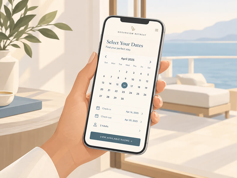
A meaningful share of hospitality bookings happen on a phone, often in exactly the moments described earlier: comparing options while traveling, browsing during a spare few minutes, deciding on something last-minute. A booking flow that works well on desktop but feels cramped, slow, or awkward on mobile is failing in the exact context where much of its actual traffic arrives.
This means calendar pickers, dropdowns, and confirmation steps all need to be evaluated specifically on a phone, not just assumed to work because they function on a larger screen. A date picker that's easy to tap through on desktop but fiddly and imprecise on a touchscreen is a meaningful source of lost bookings that rarely gets diagnosed correctly, because the business owner reviewing analytics is usually doing so on a desktop themselves.
It's worth actually testing this rather than assuming it. Loading the booking flow on an actual phone, attempting to complete it as a first-time visitor would, often reveals friction points that never show up when reviewing the site on a larger screen. Small issues, a dropdown that's hard to tap accurately, a date field that requires excessive scrolling, become significant obstacles at the exact moment a mobile visitor is deciding whether to follow through.
What Happens Immediately After Matters Too
The booking experience doesn't end the moment a visitor submits. What happens in the following minutes and hours shapes whether that visitor feels confident in their decision or starts to second-guess it. A clear, immediate confirmation, whether automated or personal, reassures a visitor that their booking actually went through and wasn't lost in a form somewhere.
Silence after submission is one of the most avoidable sources of anxiety in this entire process. A visitor who books and then hears nothing for days is left wondering whether anything actually happened, which undermines the very trust the rest of the site worked to build. Even a simple, well-written automated confirmation does meaningful work here, closing the loop on what was otherwise a leap of faith.
Handling High-Demand Dates Without Losing the Visitor
Popular dates create a specific challenge that a generic form doesn't handle well. If a visitor requests a date that isn't actually available, the worst outcome is silence, where they submit a request and simply never hear back because the business has no easy way to flag that the date doesn't work. The visitor is left assuming their booking is being processed, only to find out later, sometimes too late to book elsewhere, that it never had a chance.
A better approach makes unavailability visible and immediately offers a path forward: nearby available dates, a waitlist option, or a clear next step rather than a dead end. This turns a moment that could easily become a lost inquiry into a chance to keep the visitor engaged with a genuine alternative, rather than losing them entirely to uncertainty.
Group Bookings and Custom Requests Need Their Own Path
Not every booking fits neatly into a standard flow. Private events, large groups, multi-day packages, or highly customized requests often can't be captured accurately through the same fields used for a standard reservation, and forcing them through that same flow tends to produce incomplete or frustrating submissions on both sides.
Rather than trying to make one form handle every scenario, a distinct, clearly signposted path for these more complex requests tends to serve everyone better. A visitor planning a private event wants to feel like the business understands that this is a different kind of conversation, not a slightly larger version of a standard booking. Recognizing this distinction and building for it directly avoids the awkward experience of a group inquiry being squeezed into a form clearly designed for a single reservation.
Building Trust at the Point of Commitment
The booking step is also where any remaining hesitation tends to surface. This is the moment a visitor is asked to actually commit, sometimes with a deposit, and any unresolved uncertainty about policies, cancellations, or what exactly is included becomes far more salient here than it was earlier in the browsing experience.
Clear, easily accessible policy information at this exact point, not buried in a separate terms page discovered only by searching, reduces last-minute hesitation. A visitor who has to go hunting for a cancellation policy right before committing to a deposit is being asked to trust the business more than the site is actually making easy. Addressing this directly, right where the decision is being made, removes one of the last remaining points of friction before commitment.
What This Looks Like in Practice
None of this requires an elaborate, custom-built reservation system for every hospitality or luxury service business. What it requires is treating the booking path as a distinct, carefully considered part of the site, rather than defaulting to whatever generic contact form came bundled with the platform. The businesses that get this right tend to see it reflected directly in conversion, because they've removed the friction sitting between a genuinely interested visitor and a confirmed reservation.
This is also where the broader case for a different approach to hospitality web design becomes concrete rather than abstract. Atmosphere and visual storytelling bring a visitor to the booking step. What happens at that step determines whether all of that earlier work actually converts into business, which is ultimately the same conversion problem most underperforming websites run into, just expressed in a form specific to how hospitality and luxury bookings actually work. Getting this one part of the site right often does more for the business than any other single improvement available.
When was the last time you actually walked through your own booking process as a first-time visitor would, on a phone, with no prior context? If it's been a while, or if you're not entirely sure what that experience feels like right now, that's worth finding out before assuming the friction isn't costing you reservations. Let's take a look at your booking experience together.
Sources and Further Reading
web.dev: Payment and Address Form Best Practices
web.dev: Sign-up Form Best Practices